Climbing Down the Ladder: Abstraction, Dashboards, and Forking Paths
A response to Gelman and Fung’s ladder of abstraction: dashboards make the ladder two-way, which helps readers climb but also invites forking paths.

Gelman and Fung argue that statistical graphics confuse people because they are more abstract than they look, and that the fix is to build a sequence of graphs, starting from a concrete special case and adding one level of abstraction at a time1. Their ladder is drawn by the author and climbed in one direction. This article is about what happens when the reader holds the rope: interactive dashboards make the ladder two-way, which keeps abstract summaries honest but also turns every slicer into a forking path2.
NoteSummary of the original argument
The ladder is a narrative structure, and dashboards invert it
Each of the eight abstraction strategies is already a dashboard control
| Gelman & Fung strategy | Dashboard control | Example below |
|---|---|---|
| Concrete case / representative example | Drillthrough, tooltip page | Rung 1 |
| Expand temporal coverage | Time-intelligence, prior-year overlay | Rung 2 |
| Single → multiple samples | Small multiples | Rung 3 |
| Statistical averages | Aggregated measure vs. baseline | Rung 4 |
| Abstract space | Scatter of derived metrics | Rung 5 |
| Subgroups | Slicers, segments, decomposition tree | Forking-paths section |
| Let fixed parameters vary | Field / what-if parameters | Widget |
| Modeled or optimized values | Forecast, budget | (not shown) |
A simulated retail chain climbs the ladder in five rungs
The data are simulated so that ground truth is known: 60 stores, three regions, two site types, and three years of weekly fuel margin and gallons sold. Store volume varies and its mix shifts over time. By construction, region and site type have no effect on margin. Store-specific levels and gradual changes, seasonality, and noise affect margin.
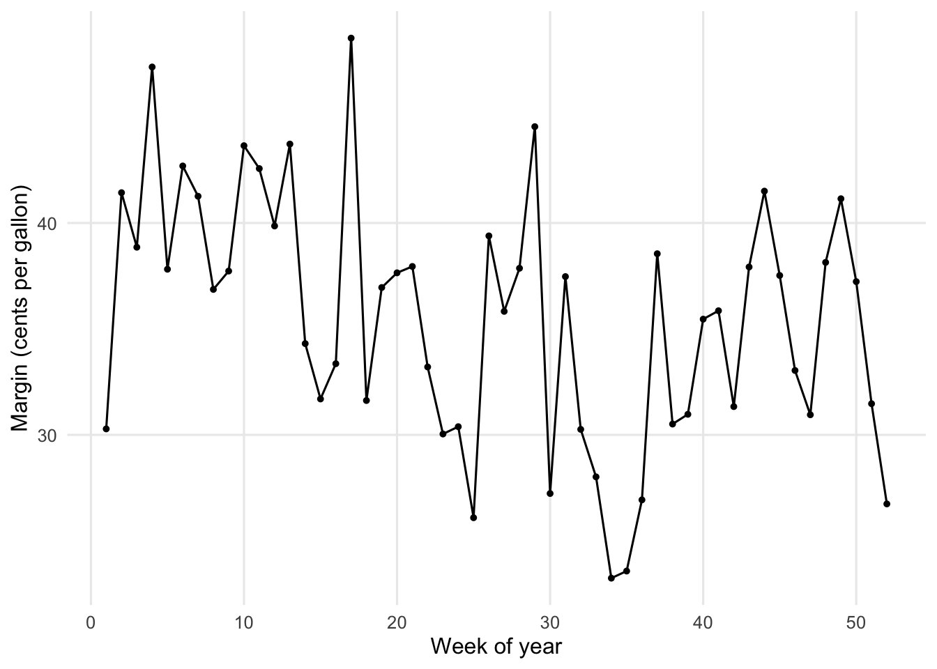
Rung 1: one store, one year
Rung 2: the same store, three years
Prior years become context, the variation-as-uncertainty move from the original paper, instead of error bars.
sales |>
  filter(store_id == focus_store) |>
  ggplot(aes(wk, margin_cpg, group = year,
             colour = year == 2026, linewidth = year == 2026)) +
  geom_line() +
  scale_colour_manual(values = c(`TRUE` = "black", `FALSE` = "grey70"),
                      guide = "none") +
  scale_linewidth_manual(values = c(`TRUE` = 0.7, `FALSE` = 0.4),
                         guide = "none") +
  annotate("text", x = 52, y = max(sales$margin_cpg[sales$store_id == focus_store]),
           label = "2026", hjust = 1, vjust = 1) +
  labs(x = "Week of year", y = "Margin (cents per gallon)")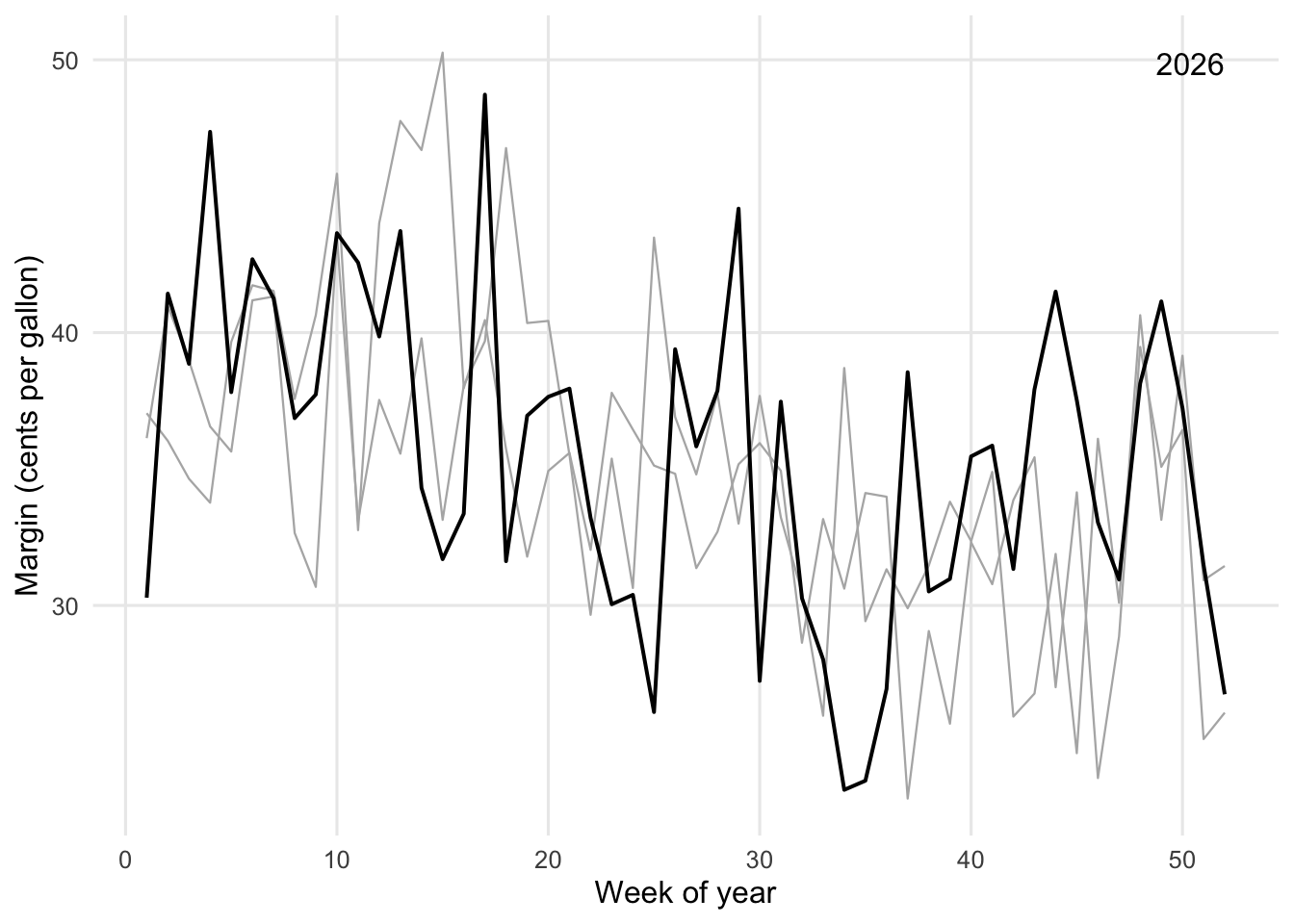
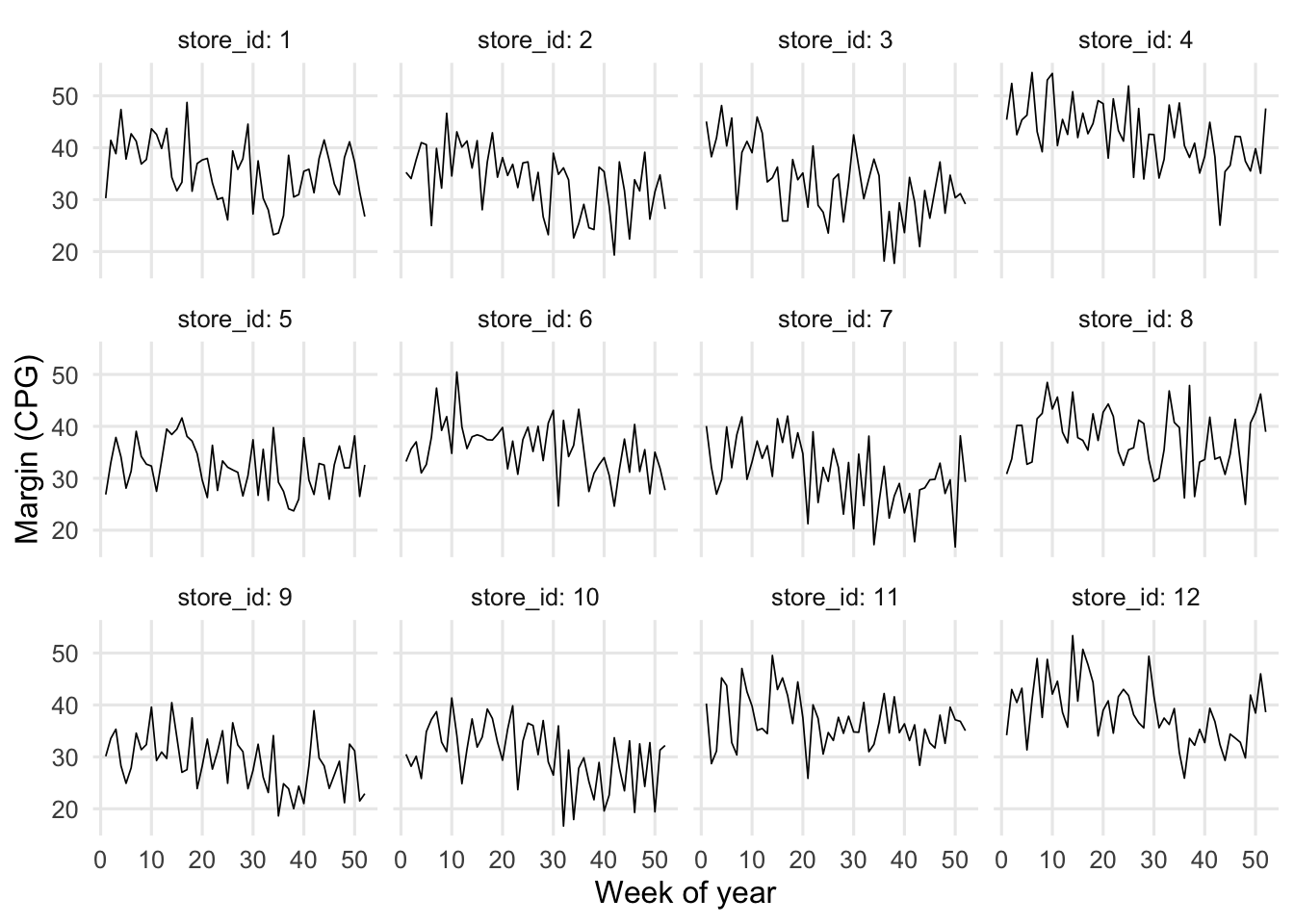
Rung 3: twelve stores as small multiples
Rung 4: the chain average, with a variation band
rung4 <- sales |>
  filter(year == 2026) |>
  group_by(wk) |>
  summarise(avg = mean(margin_cpg),
            lo  = quantile(margin_cpg, 0.25),
            hi  = quantile(margin_cpg, 0.75)) |>
  ggplot(aes(wk)) +
  geom_ribbon(aes(ymin = lo, ymax = hi), fill = "grey85") +
  geom_line(aes(y = avg)) +
  labs(x = "Week of year", y = "Margin (CPG)")

rung4
ggsave("../images/ladder-dashboards.png", plot = rung4,
       width = 8, height = 4.5, dpi = 150, bg = "white")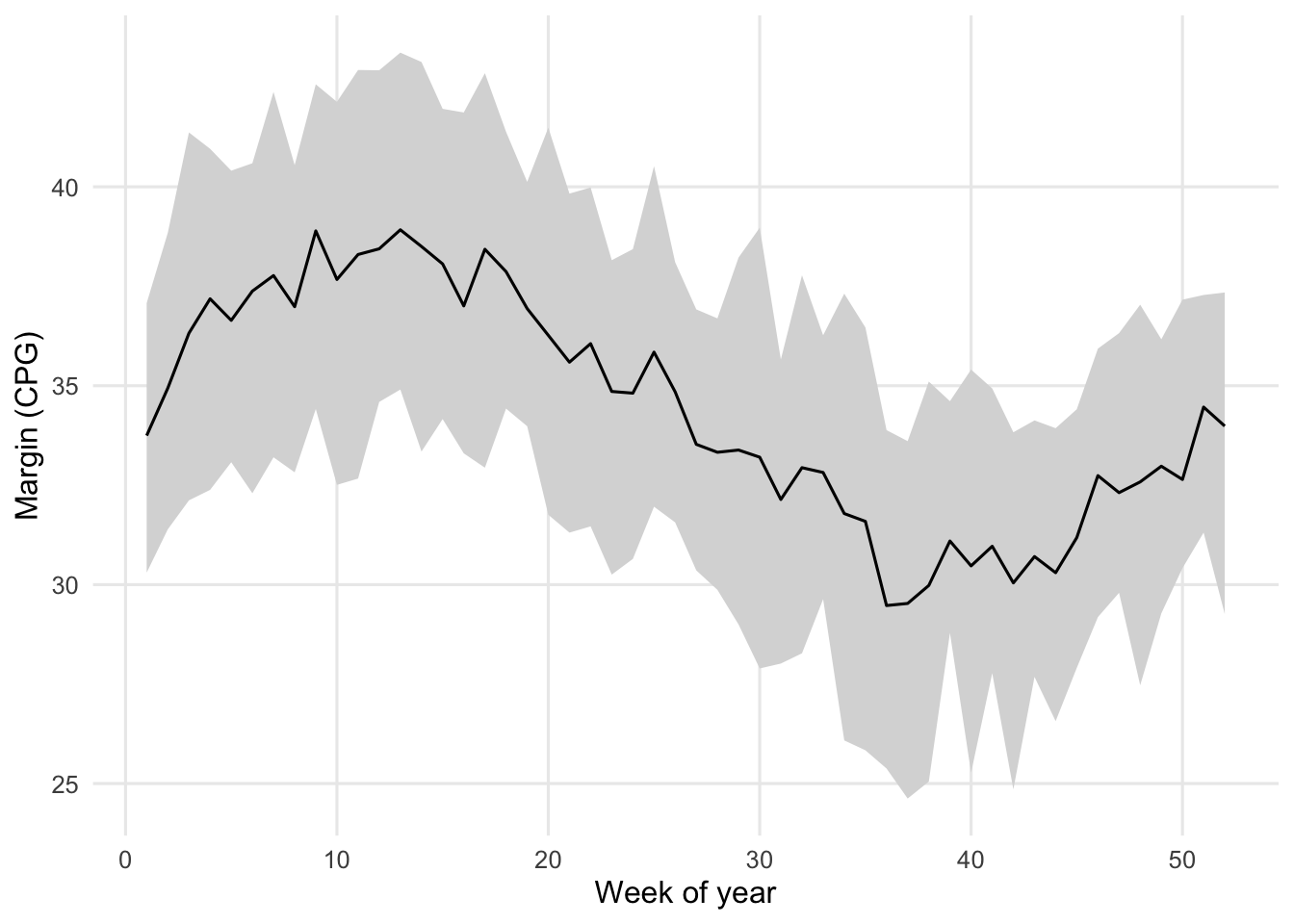
Rung 5: every store becomes a dot
Rung 1 was an entire line. Here it is a single labelled dot, which is the “this line is now that dot” move that makes the original paper work.
ggplot(store_summary, aes(mean_margin, volatility)) +
  geom_point(colour = "grey50") +
  geom_point(data = filter(store_summary, store_id == focus_store),
             colour = "black", size = 3) +
  geom_text(data = filter(store_summary, store_id == focus_store),
            aes(label = "Store 1 (rung 1)"), hjust = -0.15) +
  labs(x = "Mean margin (CPG)", y = "Volatility (SD of weekly margin)")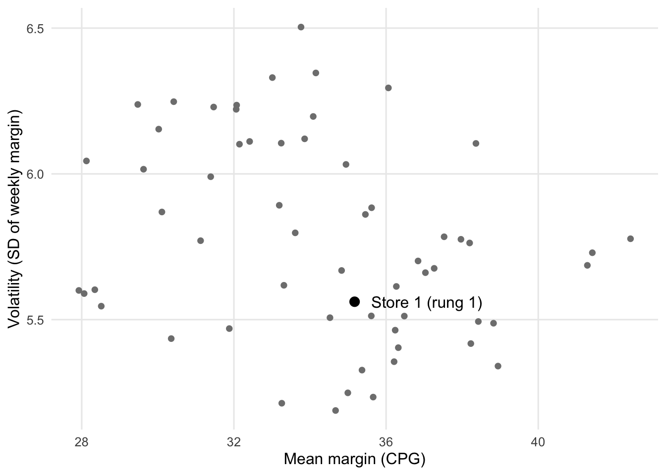
Letting readers climb freely produces confident nonsense
# Every slice a reader can click: region x site type x year x quarter.
# Each slice is compared with the rest of the chain, store as the unit.
slice_tests <- function(sales) {
  store_q <- sales |>
    mutate(quarter = (wk - 1) %/% 13 + 1) |>
    group_by(store_id, region, site_type, year, quarter) |>
    summarise(m = mean(margin_cpg), .groups = "drop")

  expand_grid(r = unique(store_q$region), s = unique(store_q$site_type),
              y = 2024:2026, q = 1:4) |>
    mutate(out = pmap(list(r, s, y, q), function(r, s, y, q) {
      d <- filter(store_q, year == y, quarter == q) |>
        mutate(in_slice = region == r & site_type == s)
      p <- tryCatch(t.test(m ~ in_slice, data = d)$p.value,
                    error = function(e) NA_real_)
      tibble(n_stores = sum(d$in_slice), p = p)
    })) |>
    unnest(out) |>
    mutate(s_value = -log2(p), p_bh = p.adjust(p, method = "BH"))
}

results <- slice_tests(sales)
n_tests <- sum(!is.na(results$p))
max_s   <- max(results$s_value, na.rm = TRUE)

# Repeat on many independent null chains to see how often a reader "finds" something.
n_sims <- 200
sims <- map_dfr(seq_len(n_sims), function(i) {
  r <- slice_tests(make_sales(1000 + i))
  tibble(any_raw = any(r$p < 0.05, na.rm = TRUE),
         any_bh  = any(r$p_bh < 0.05, na.rm = TRUE),
         n_raw   = sum(r$p < 0.05, na.rm = TRUE))
})
pct_any_raw <- round(100 * mean(sims$any_raw))
pct_any_bh  <- round(100 * mean(sims$any_bh))
A reader who slices by region, site type, year, and quarter makes 72 comparisons. In the chain plotted above, the most surprising slice carries an S-value of 4.6 bits1, on data where no region or site-type effect exists. Across 200 independently simulated null chains, 72% let a reader find at least one slice with p < 0.05. After a Benjamini–Hochberg correction across the slices, 8% still do5, 6.
1 See S-values for why bits are a more honest scale than p here.
NoteWhy the “discoveries” cluster by slice
Store effects are fixed across time, so a region × site-type cell that happened to draw a few high-margin stores looks “significant” in quarter after quarter. The repetition feels like replication. It is the same stores counted again.
Five rules extend the ladder to two-way travel
- Anchor every abstract view to a concrete case. Hover or click on a dot to reach its line (rung 5 → rung 1).
- Say which rung you are on. Dynamic titles stating the metric, grain, filters, and n. Titles dominate recall: in one experiment with 200 participants, 34% of recalled messages matched a misleading title and 14% matched the chart7.
- Keep encodings fixed across rungs. Same colour, same meaning; shared axes in small multiples.
- Show n and suppress anecdotes. Flag any slice below a minimum number of units.
- Separate exploring from confirming. Save a pattern found by slicing as a candidate hypothesis, then evaluate it with a design suited to the claim. A later period checks persistence; it does not by itself establish a causal explanation.
A dashboard should preserve the question as the view changes
A dashboard lets readers move among displays, but not every movement means the same thing. Changing a chart can leave the question intact; changing the stores or the measure can change what is being described.
| Movement | Fuel-margin example | Make explicit |
|---|---|---|
| Representation | Show the same stores and measure as a trend, distribution, or scatterplot | The population, metric, units, and period stay fixed |
| Aggregation | Move from chain to region to store | What each mark represents and how values are combined |
| Population | Filter to highway stores in one region | Which stores remain, how many, which are excluded, and the comparison group |
| Question | Switch from margin per gallon to total margin dollars, or from level to volatility | Metric, denominator, units, weighting, and what the comparison means |
| Comparison | Compare with budget, prior year, or peer stores | Which reference defines better or worse performance |
An illustrative drill path might begin with a chain-level decline, identify the regions contributing to it, inspect the distribution across stores, select one store, and descend to its weekly history and source records. That is a design scenario, not a finding from the simulated series above. At every step, keep a small reference view of the chain and the original period. Show the selected stores alongside a named benchmark: the whole chain, the rest of the chain, comparable stores, or the same stores in another period. A changing chart is much easier to interpret when the reader can still see what it changed from.
Each view should answer a part of the business question. The overview shows margin dollars, gallons, and cents per gallon; the store distribution shows whether the movement is widespread or concentrated; subgroup comparisons show where to investigate; and store histories expose the weeks behind the summary. Provide an obvious route back to the overview, preserving the reader’s selection. A drillthrough to source records should carry the selected store and period so that the detail actually explains the mark the reader clicked.
Aggregation is another movement
“Average store margin” gives each store equal weight. “Margin per gallon across the chain” weights stores by gallons sold: total margin dollars divided by total gallons, expressed in cents per gallon. Neither is universally correct; the appropriate measure depends on the decision. The second measure needs volume data, so the simulation now includes store-week gallons and deliberately lets sales mix shift while leaving the margin-generating process independent of region and site type.
The figure compares the equal-store average with the current-volume-weighted margin and a version using each store’s average 2024 volume as a fixed weight. The latter keeps the store roster and weights fixed, making changes in store margins easier to distinguish from changes in sales mix. In this simulation, store-specific margin drift is generated independently of a deliberate shift in gallons toward stores with higher baseline margins; holding 2024 weights fixed removes that mix shift from the weighted comparison.
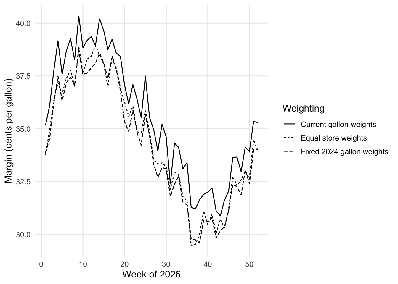
The simulation keeps the same 60 stores in every year, so its annual equal-store comparison is a same-store comparison by construction. The North rows below show what a population filter does to both the included count and the observed average; they do not estimate a regional effect. Comparing the current-volume and fixed-2024-weighted columns holds the store-level margins constant within each year while changing the weights. A real dashboard should also report when stores enter or leave the available population. Fixed weights are a useful question to ask, not a uniquely correct adjustment.
annual_diagnostics |>
  transmute(
    Year = year,
    `Stores in chain` = n_stores,
    `Equal-store mean (cpg)` = round(equal_store, 3),
    `Current-volume mean (cpg)` = round(current_mix, 3),
    `Fixed-2024-weight mean (cpg)` = round(fixed_mix, 3),
    `North stores` = north_n,
    `North mean (cpg)` = round(north_mean, 3)
  ) |>
knitr::kable()| Year | Stores in chain | Equal-store mean (cpg) | Current-volume mean (cpg) | Fixed-2024-weight mean (cpg) | North stores | North mean (cpg) |
|---|---|---|---|---|---|---|
| 2024 | 60 | 34.2 | 33.9 | 33.9 | 25 | 33.6 |
| 2025 | 60 | 34.4 | 34.8 | 34.1 | 25 | 33.9 |
| 2026 | 60 | 34.4 | 35.6 | 34.2 | 25 | 34.1 |
For the annual table, each store’s margin is itself weighted by its weekly gallons. Weighting those annual store rates by annual volume then reproduces total chain margin dollars divided by total chain gallons. An unweighted average of weekly rates would answer a different question and need not reconcile to that ratio.
Give executives and analysts different starting points
An executive overview can start with a few decision-relevant metrics, trends, and distributions, then offer guided routes into exceptions. An analyst view can expose flexible dimensions, alternative measures, side-by-side subgroup comparisons, and detailed records. These are two entry points into the same underlying data, not two incompatible definitions of performance. Both views should carry the metric definition, filters, benchmark, data freshness, and coverage; readers should be able to return to the overview without losing the analysis they were exploring.
For the executive, the opening view should answer: what changed, how much does it matter, and where should we look? For the analyst, the next views should support asking whether the pattern persists under a different aggregation, comparison, or population. A useful control for both is to pin two selections side by side, such as highway and neighborhood stores. Keep the measure, period, and axes consistent, and show each selection’s store count and gallons. This makes the comparison inspectable without relying on memory of the chart that appeared before the last filter change.
A compact context strip can accompany every view: metric and units, grain, period, active filters, benchmark, included and missing units, and data refresh time. Export that context with the chart. Otherwise, a screenshot of a subgroup can circulate as if it described the entire chain.
Describe a slice before generalizing from it
“Highway stores had lower observed margin last month” describes the selected data. “Highway stores systematically underperform” generalizes beyond those observations; “highway locations cause lower margin” makes a causal claim. Filtering is useful for description. The inferential risk begins when a pattern selected after exploration is treated as a persistent effect, a forecast, or a cause. Pu and Kay distinguish exploratory tasks that retrieve or describe observed data from claims that generalize beyond those data6.
For a pattern worth pursuing, save the question, filters, comparison, metric, data version, and proposed follow-up that produced it, then evaluate it with a design suited to the claim. Keep the exploratory status visible when the finding is shared. Recording the path makes it reviewable; it does not validate the conclusion or account for all the other paths considered. A later period can test whether the pattern persists, but seeing the same stores again is not an independent replication and cannot establish a causal explanation on its own.
Try climbing it yourself
rung = "1 · One store"
sales = Array(3120) [Object, Object, Object, Object, Object, Object, Object, Object, Object, Object, Object, Object, Object, Object, Object, Object, Object, Object, Object, Object, …]
storesD = Array(60) [Object, Object, Object, Object, Object, Object, Object, Object, Object, Object, Object, Object, Object, Object, Object, Object, Object, Object, Object, Object, …]
References
1. Gelman A, Fung K. (2025). “The ladder of abstraction in statistical graphics.” https://sites.stat.columbia.edu/gelman/research/published/ladder.pdf.
2. Gelman A, Loken E. (2014). “The statistical crisis in science.” American Scientist. 102:460–465. doi: 10.1511/2014.111.460.
3. Segel E, Heer J. (2010). “Narrative visualization: Telling stories with data.” IEEE Transactions on Visualization and Computer Graphics. 16:1139–1148. doi: 10.1109/TVCG.2010.179.
4. Shneiderman B. (1996). “The eyes have it: A task by data type taxonomy for information visualizations.” In: Proceedings 1996 IEEE symposium on visual languages. p. 336–343. doi: 10.1109/VL.1996.545307.
5. Zgraggen E, Zhao Z, Zeleznik R, Kraska T. (2018). “Investigating the effect of the multiple comparisons problem in visual analysis.” In: Proceedings of the 2018 CHI conference on human factors in computing systems. doi: 10.1145/3173574.3174053.
6. Pu X, Kay M. (2018). “The garden of forking paths in visualization: A design space for reliable exploratory visual analytics.” In: Proceedings of the 2018 IEEE evaluation and beyond – methodological approaches for visualization (BELIV). https://mucollective.northwestern.edu/files/2018-ForkingPaths-BELIV.pdf.
7. Kong H-K, Liu Z, Karahalios K. (2019). “Trust and recall of information across varying degrees of title-visualization misalignment.” In: Proceedings of the 2019 CHI conference on human factors in computing systems. doi: 10.1145/3290605.3300576.
Comments